A recent survey by Educause noted that median technology spend among colleges and universities in fiscal year 2021 was $7.7 million, with nearly one-third of respondents saying that they plan to increase this amount in the following year. The reasons for this level of increasing spend are complex and in some cases spurred by the pandemic, in others not.
One thing, however, is certain: as technology spend increases, so does the pressure to ensure a return on these investments. Improving retention rates, for example, is a common goal—but when investing in technology to achieve this goal it is important to remember that correlation is not causation.
Our Approach
Before diving into the findings, it would be helpful to get a good sense of the problem we are looking to solve. Let us suppose you manage a restaurant and want to know which employees, together or alone, result in the most profit on any given night. You need to start by measuring each employee's contribution and the contributions of different combinations of employees against the earnings over a certain period, isolating shifts in customers and seasons.
This problem sounds challenging, especially if your restaurant has many employees and, therefore, many different permutations of employees together. Luckily, there is an approach designed to address this problem. Called "Shapley Additive Explanations (SHAP)," this approach looks to determine the average marginal contribution of an instance of a feature—employees, a certain type of technology—among all possible feature combinations and establish which feature and combination contribute the most to a given outcome.
We can also use this type of analysis—evaluating the effectiveness of technology—by testing each feature (type of technology) and feature combination (groupings of technologies) against an output (retention rates) and determining which leads to the best prediction. To do this, we leveraged implementation data from LISTedTech for over 500 public, four-year institutions for all technology segments in our Student Success and Instruction and Admission and Enrollment categories of our Higher Education Technology Landscape. We used four-year retention rates for full-time students, as measured in 2020 IPEDS data, as our outcome.
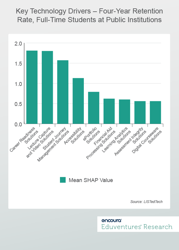
Figure1 shows the technology segments with the most additive contributions, as measured by the average marginal contribution (SHAP value) to the outcome. To draw on our example above, Career Readiness Solutions would be the "employee" that contributed the most to high retention rates, with Lecture Capture and Video Solutions being the next higher contributor, etc.
Figure 1
At this point, there are already some obvious results and some surprising ones. For example, it makes sense that Career Readiness Solutions are the higher contributors, as students with a clear understanding of their career paths may be more likely to persist at their institutions. Yet, the presence of Lecture Capture and Video seems odd but may make more sense when we consider that many of the institutions in our data set had high rates of remote learning in 2020, and that these rates strongly correlate with implementations of solutions in this segment.
One might want to stop here and state that all institutions should prioritize their technology investments based on the contributions of each type featured in Figure 1—or better yet, buy all of them. While this does resonate, it is also essential to discover which solutions work best together so that implementing one solution does not blunt or lessen the impact of another driver.
Understanding Interactions
To this end, we turned to a statistical technique called "interaction effects." Simply put, interaction effects go beyond measuring the effect of one variable on an outcome (as in our analysis above) and ask whether adding a variable might increase that effect. For example, we may see that two employees separately might not contribute to the most profit but contribute greatly when working together.
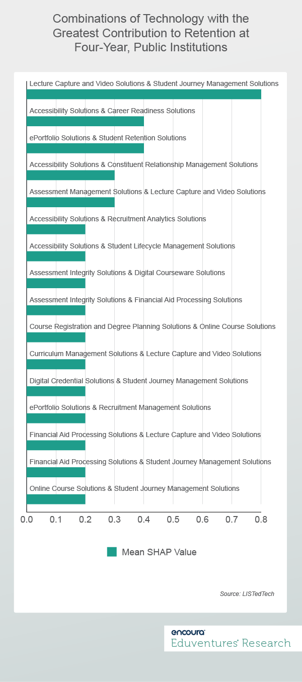
As shown in Figure 2, 16 technology interactions show the most substantial additive contribution to retention rates.
Figure 2
This data shows that some of the segments identified in the first figure (such as Learning Analytics Solutions) do not form interactions with other technologies that lead to high additive contributions. Likewise, we have different solutions (Student Retention Solutions, for example) that, while not appearing in Figure 1 as providing a high additive contribution on their own, do provide it when combined.
What should we take away from this analysis? Going back to the restaurant metaphor, we see some "employees" contributing significantly on their own, such as Student Journey Management Solutions and Career Readiness Solutions. Likewise, we notice that some only contribute a lot independently and not in combination with other solutions, such as Learning Analytics Solutions. Some solutions, however, add greater value if combined with others, such as Student Retention Solutions.
The Bottom Line
While the restaurant metaphor is somewhat playful, it reflects the institutional leader’s role: ensuring that they have the correct components in their technology ecosystems and understanding how they work best together to overcome the challenges at their institutions. An approach such as ours would support this role. Measuring each solution's contributions and combinations of solutions in any outcome (admissions rates, graduation rates, etc.) would go a long way toward ensuring that leaders select the right technologies for their ecosystems.
This approach would help vendors as well. Having insight into the additive contributions of their products can help inform product positioning and illuminate other factors that may need to be in place to increase the additive contributions of their products.
Never Miss Your Wake-Up Call
Learn more about our team of expert research analysts here.
Eduventures Principal Analyst at Encoura
Contact
Eduventures 2022 Higher Education Technology Landscape (Landscape) visualizes 367 vendors and their products, organized into over 44 separate market segments rolled up into four major categories aligned to the student lifecycle.
Throughout the year, we analyze these vendors and products and make that content available to clients. Several vendors have multiple products in their education technology portfolios.
The Program Strength Assessment (PSA) is a data-driven way for higher education leaders to objectively evaluate their programs against internal and external benchmarks. By leveraging the unparalleled data sets and deep expertise of Eduventures, we’re able to objectively identify where your program strengths intersect with traditional, adult, and graduate students’ values, so you can create a productive and distinctive program portfolio.


