
Two weeks ago, Google announced that it will be boosting the ranking of mobile-friendly pages on its mobile search results. For colleges and universities, of course, this also means the converse will be true: college websites that are not optimized for mobile accessibility may suddenly be harder to find within Google’s search results when viewed from mobile devices.
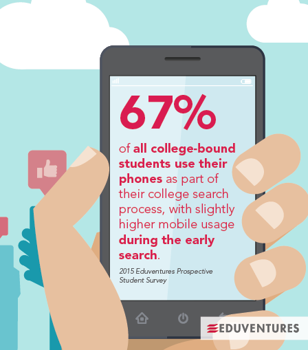
In our view, this is yet another sign that having a mobile-friendly site has transitioned from a nice-to-have to a must-have. Our 2015 Prospective Student Survey shows that 67% of all college-bound students use their phones as part of their overall college application experience, with slightly higher mobile usage during the early search and college list phases of the process. Not having a mobile-optimized admissions website could mean that you reach fewer students at the earliest part of their college search experience.
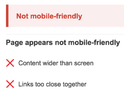
 Another tool to use is Google’s own Mobile-Friendly Test. Launched in conjunction with its recent announcement about optimizing search algorithms for mobile sites, this tool is provided as a free service to help website developers measure whether their sites conform to Google’s mobile-friendly standards. Simply provide your website URL and you will get helpful feedback such as, “Content is wider than the screen,” or “Links are too close together,” along with instructions for developers on how to remedy these issues quickly.
Figure 2. Eduventures research, as seen by Google on mobile
Another tool to use is Google’s own Mobile-Friendly Test. Launched in conjunction with its recent announcement about optimizing search algorithms for mobile sites, this tool is provided as a free service to help website developers measure whether their sites conform to Google’s mobile-friendly standards. Simply provide your website URL and you will get helpful feedback such as, “Content is wider than the screen,” or “Links are too close together,” along with instructions for developers on how to remedy these issues quickly.
Figure 2. Eduventures research, as seen by Google on mobile
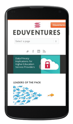 Figure 3. Mobile-friendly example (eduventures.com)
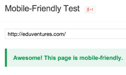 Figure 4. Mobile-unfriendly example
 To ensure that you are meeting the regulatory compliance of Section 508 by providing a website that is accessible to visitors with assistive devices, include an accessibility audit as part of your website launch and repeat it any time you do a major content update on your site. Using the free tool, AChecker, you can quickly get a report on whether your website is compliant with all major web content accessibility guidelines. Your IT staff or outsourced firm can then use that report to identify any coding changes required to make sure that persons with disabilities will get the most of your website and see the same enrollment or advancement messaging that your other users experience.
Promoting Mobility and Accessibility
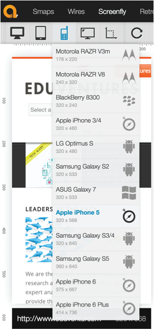
While many schools understand that they need to have a strong mobile presence to reach Generation Z students, who spend most of their time online, they are less sure about where to start the process. How do you know your site will work well on all of those devices, as well as on new devices coming out on a near weekly basis? One of the best ways is to use the free device simulator provided by Quirktools called Screenfly. Just enter your institution’s URL, and you can jump between different mobile browsers, orientations, and screen resolutions, all without needing to own a single mobile device. You can see how your site looks on the latest iPhone 6, for example, and quickly see if important content, navigation, or images scale properly or are cut off and become unreadable when your site is viewed on the small screen. Figure 1. Screenfly preview on Apple iPhone 5
Another tool to use is Google’s own Mobile-Friendly Test. Launched in conjunction with its recent announcement about optimizing search algorithms for mobile sites, this tool is provided as a free service to help website developers measure whether their sites conform to Google’s mobile-friendly standards. Simply provide your website URL and you will get helpful feedback such as, “Content is wider than the screen,” or “Links are too close together,” along with instructions for developers on how to remedy these issues quickly.
Figure 2. Eduventures research, as seen by Google on mobile
Figure 3. Mobile-friendly example (eduventures.com)
Figure 4. Mobile-unfriendly example
To ensure that you are meeting the regulatory compliance of Section 508 by providing a website that is accessible to visitors with assistive devices, include an accessibility audit as part of your website launch and repeat it any time you do a major content update on your site. Using the free tool, AChecker, you can quickly get a report on whether your website is compliant with all major web content accessibility guidelines. Your IT staff or outsourced firm can then use that report to identify any coding changes required to make sure that persons with disabilities will get the most of your website and see the same enrollment or advancement messaging that your other users experience.